Intro to Hawley
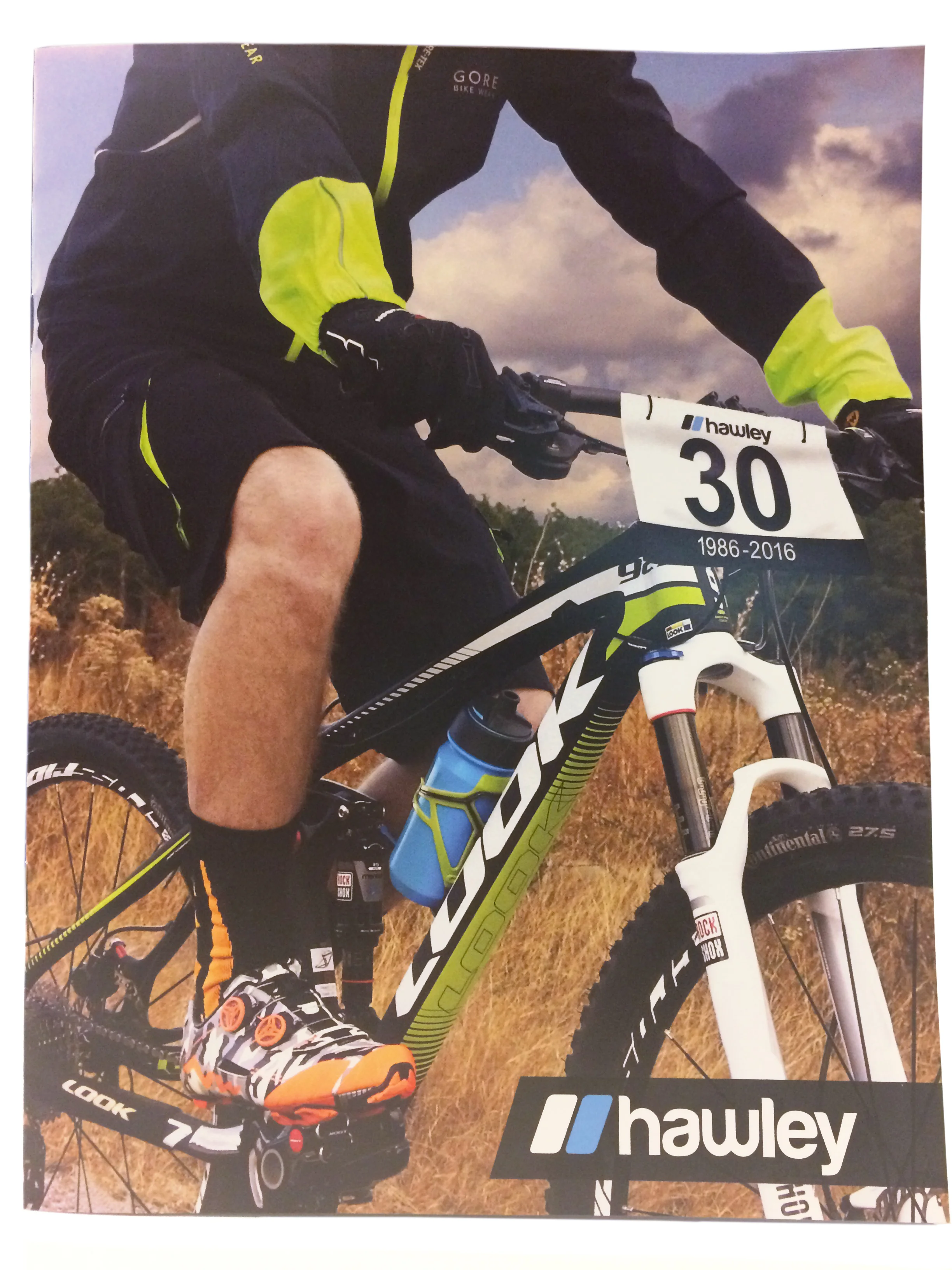
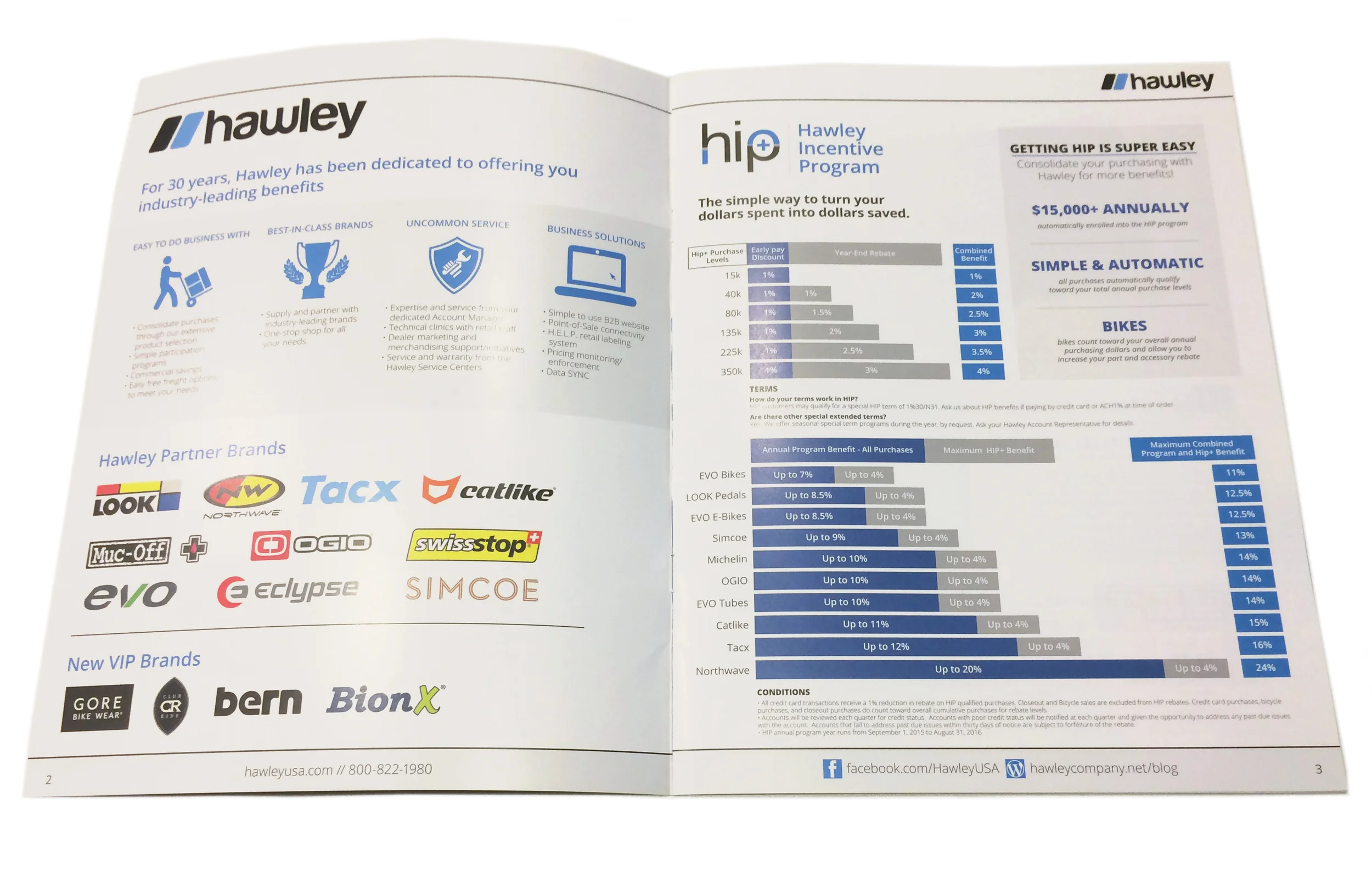
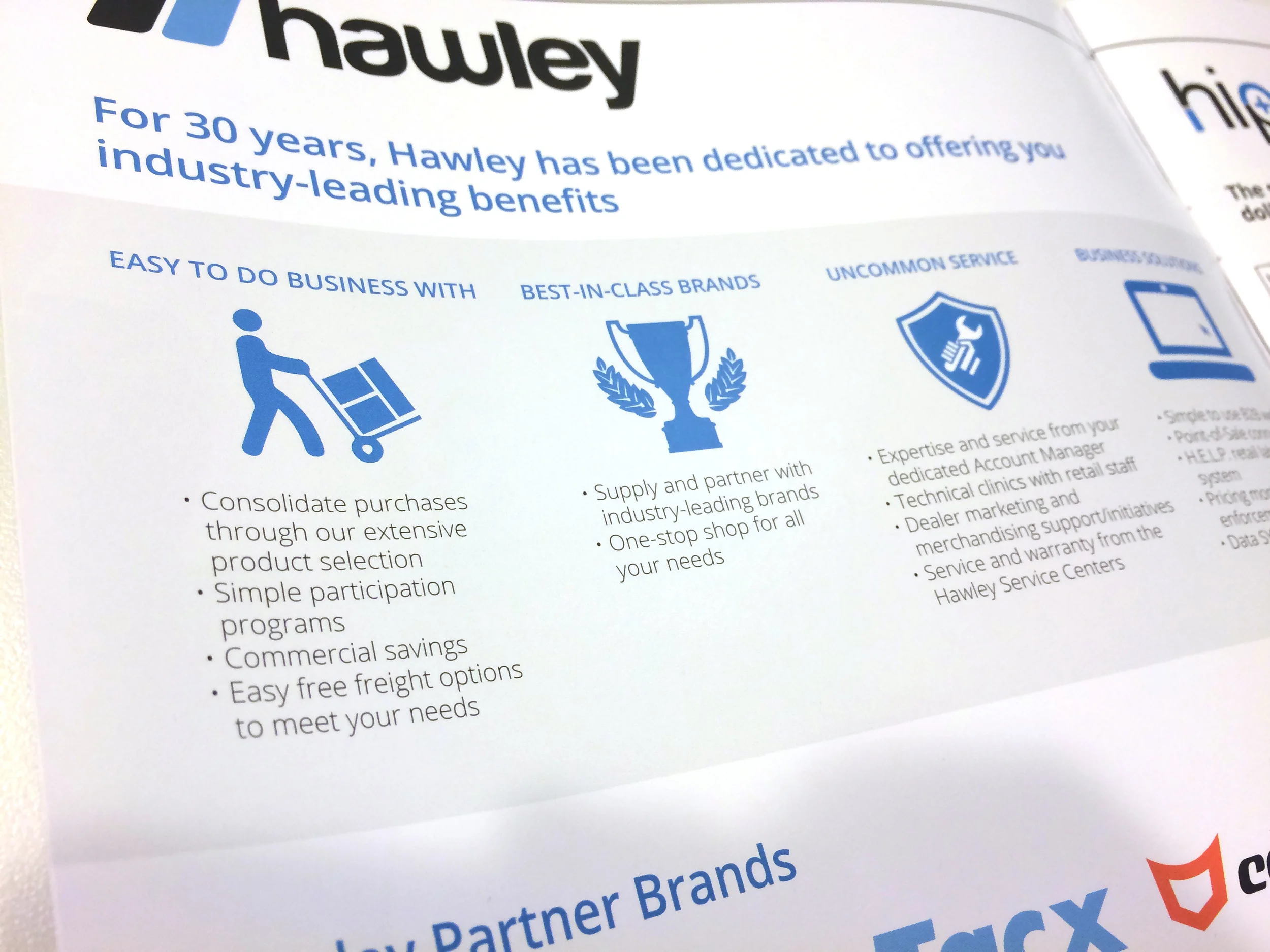
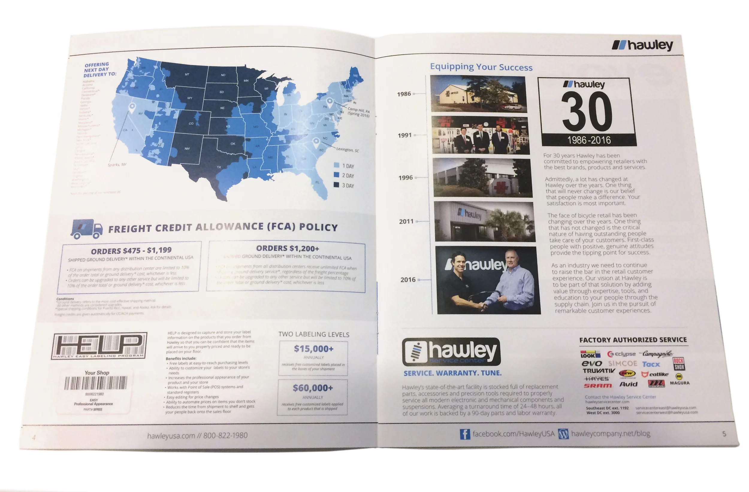
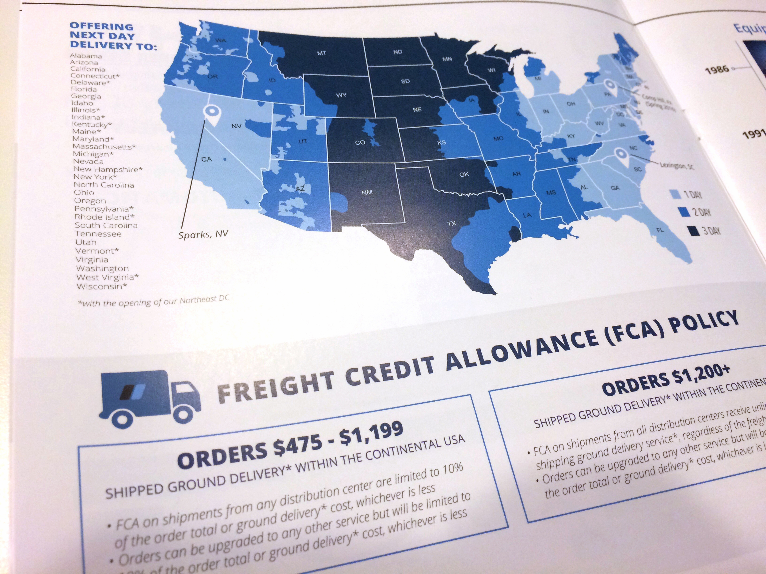
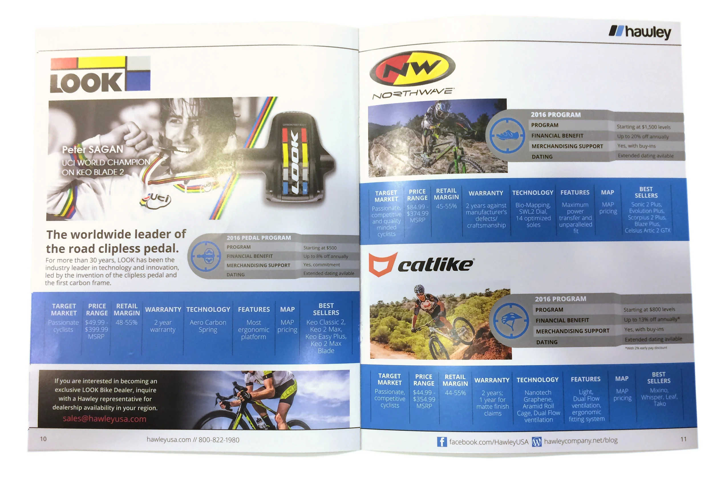
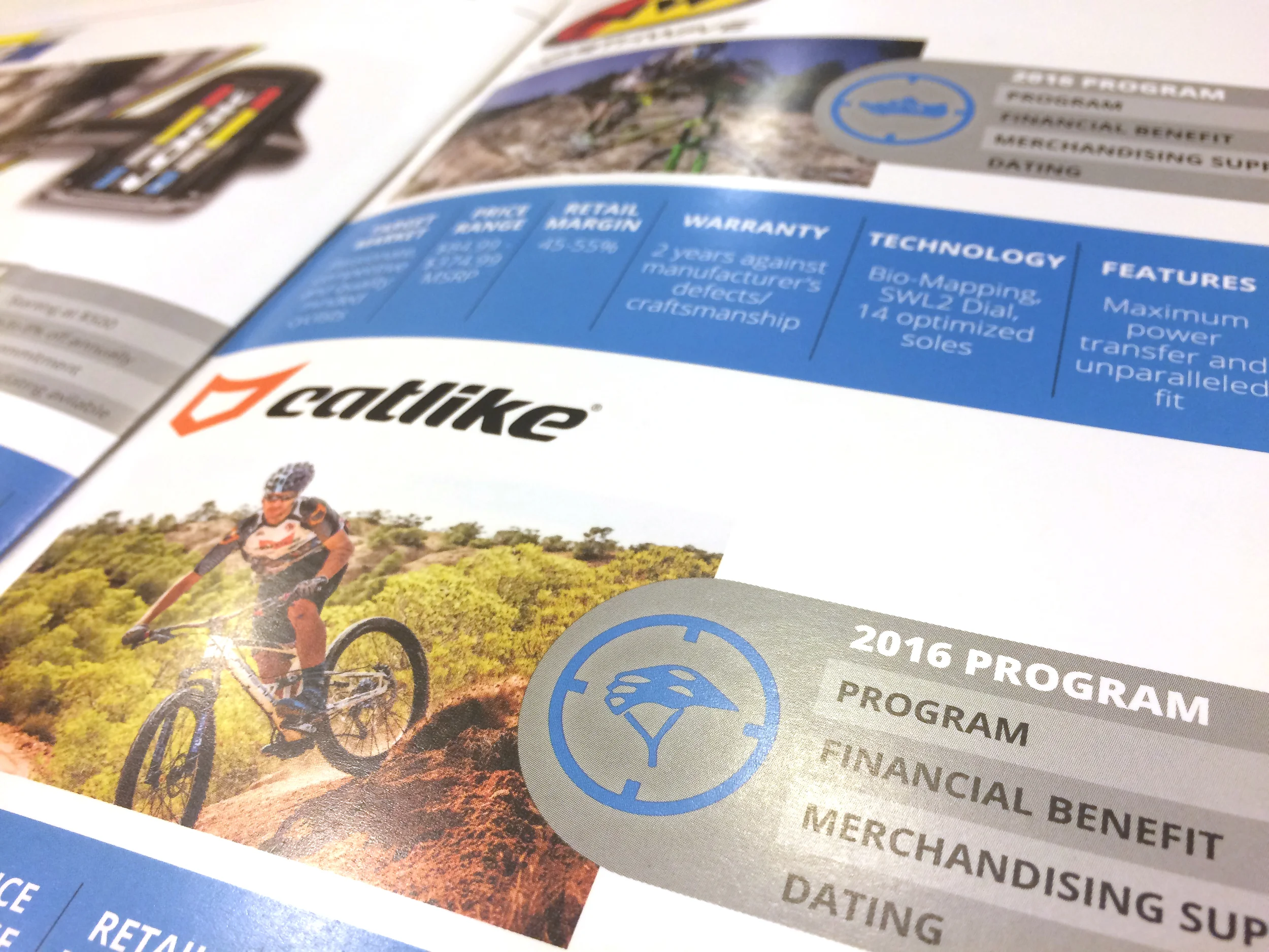
Selling booklet to showcase what Hawley is all about. I redesigned the look for 2016, making it more professional and cohesive. My concept for the cover is to portray Hawley’s 30 year anniversary in the form of a mountain bike race tag, with the rider and bike sporting products we sell.
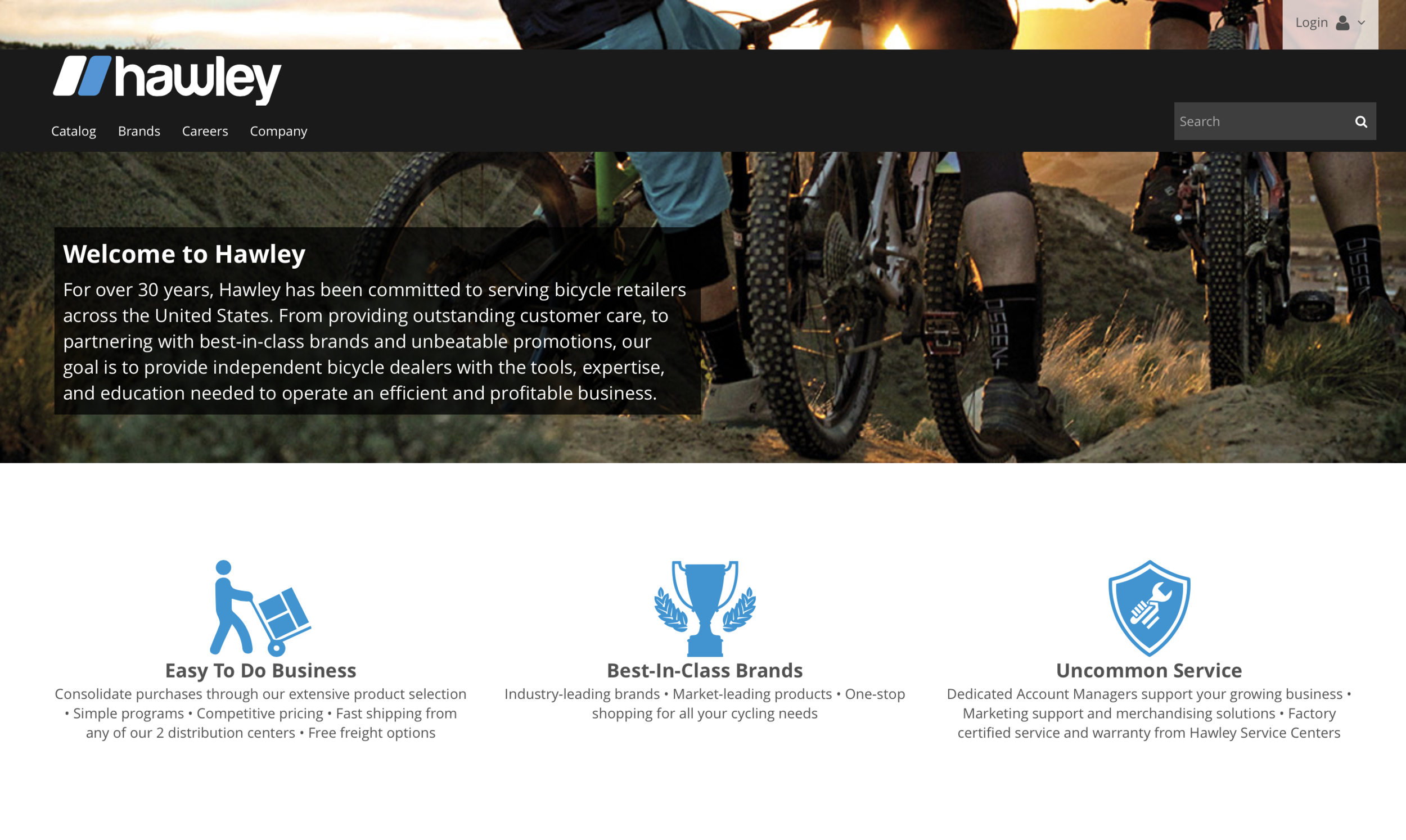
Branding Icons on new Hawley website
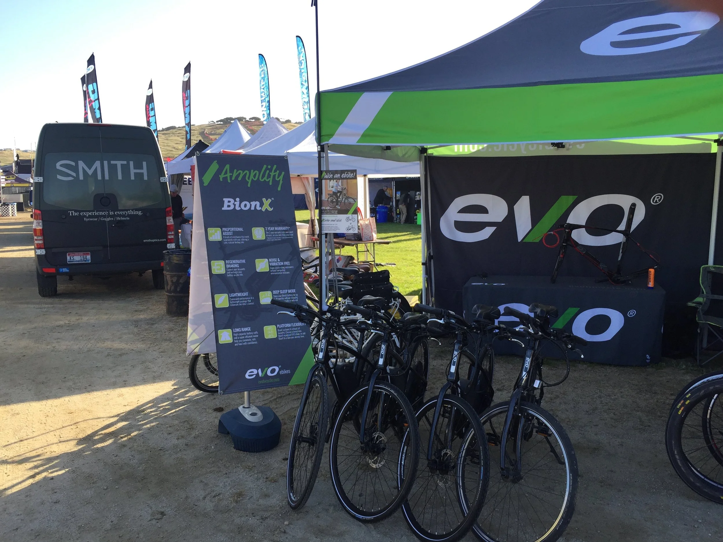
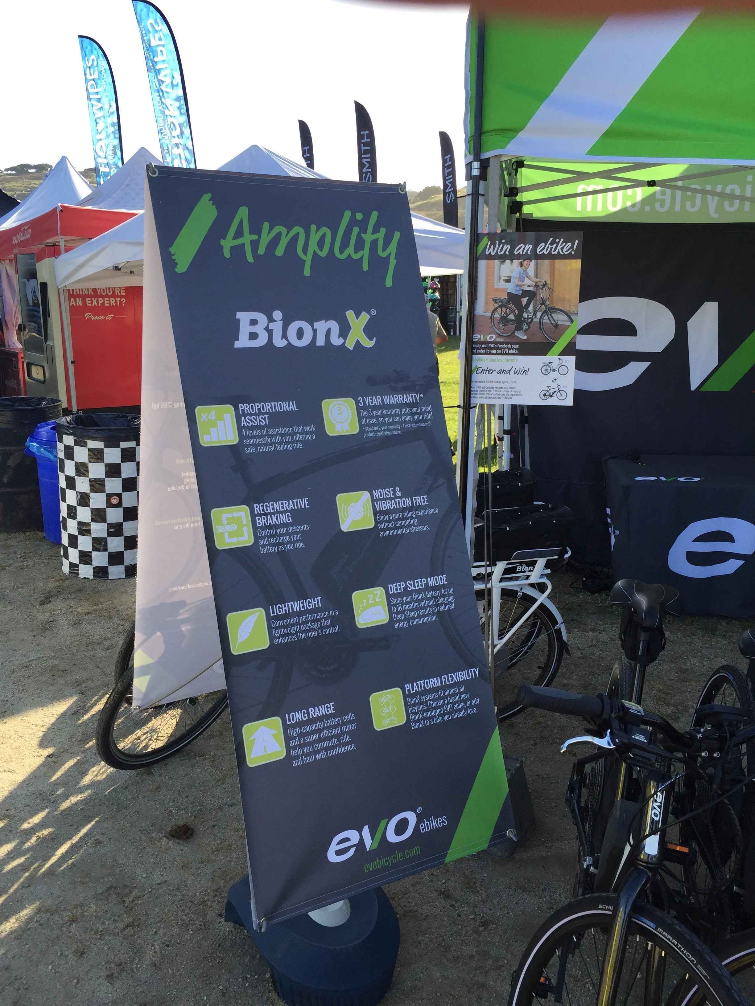
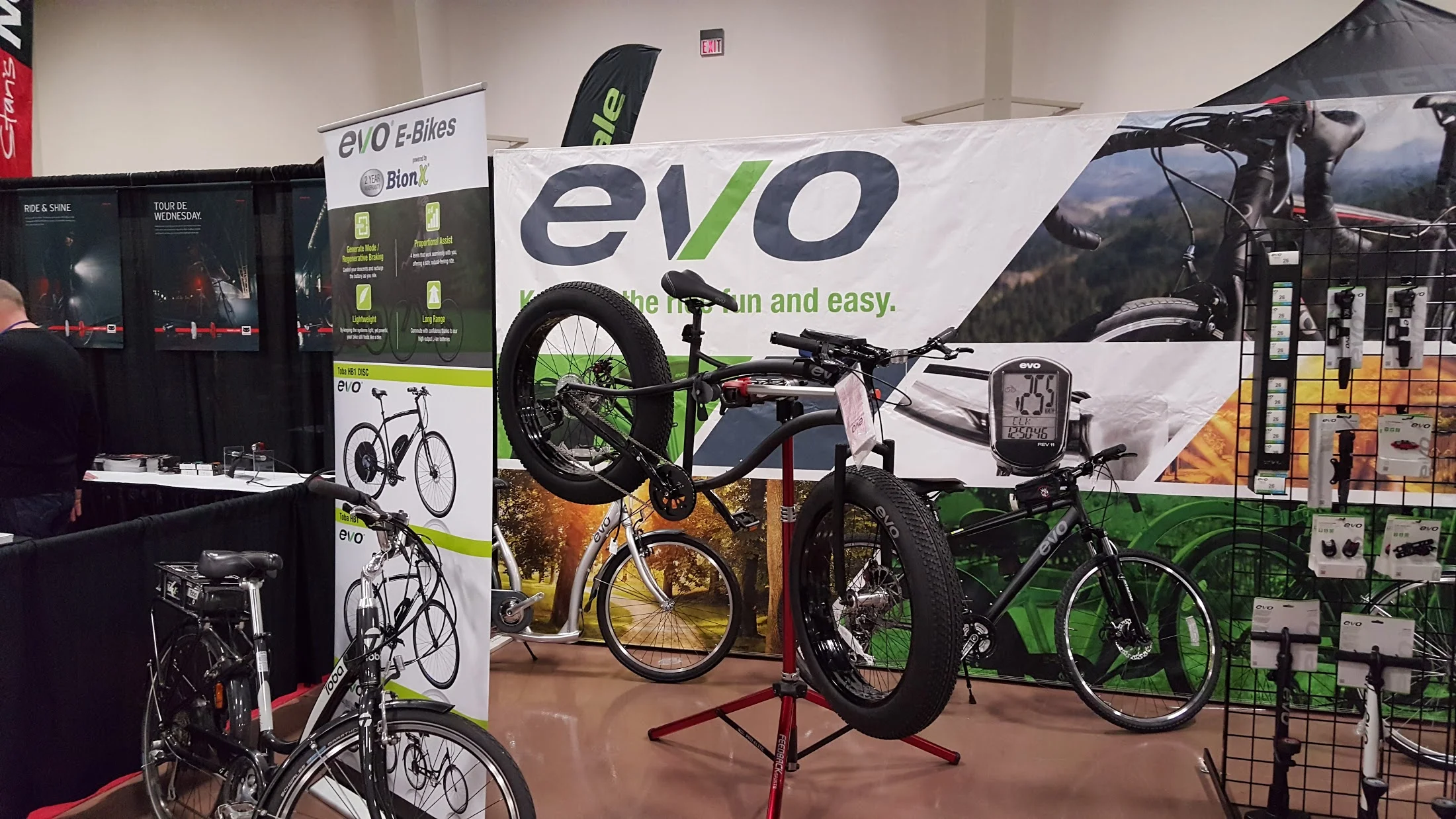
Trade Show Banners


2015 Catalog Design for Hawley
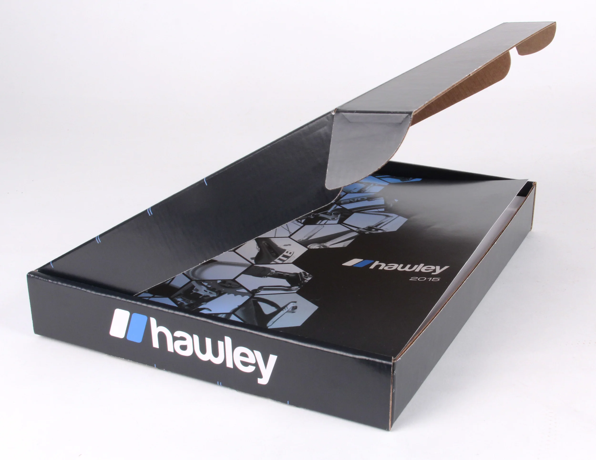
My concept behind the catalog was to take up close photos of bikes and bike parts as to almost abstract them, so the viewer will have to take a closer look to figure out what it is. I knew I wanted to do a grid layout of photos but didn't want to use simple squares. So I ended up using hexagons, creating a kinda honeycomb pattern going down the page. Coincidently, the pattern ended up looking like a chain from a bike.


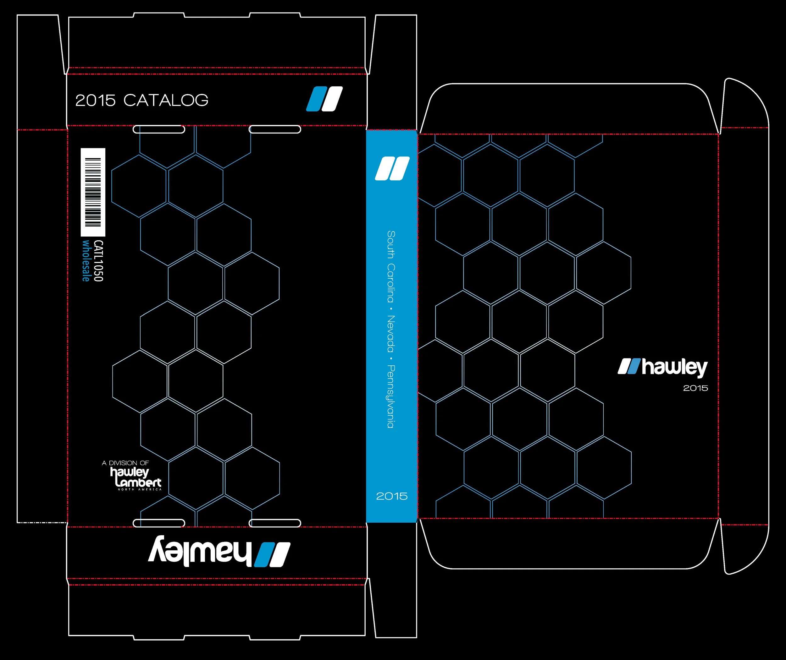
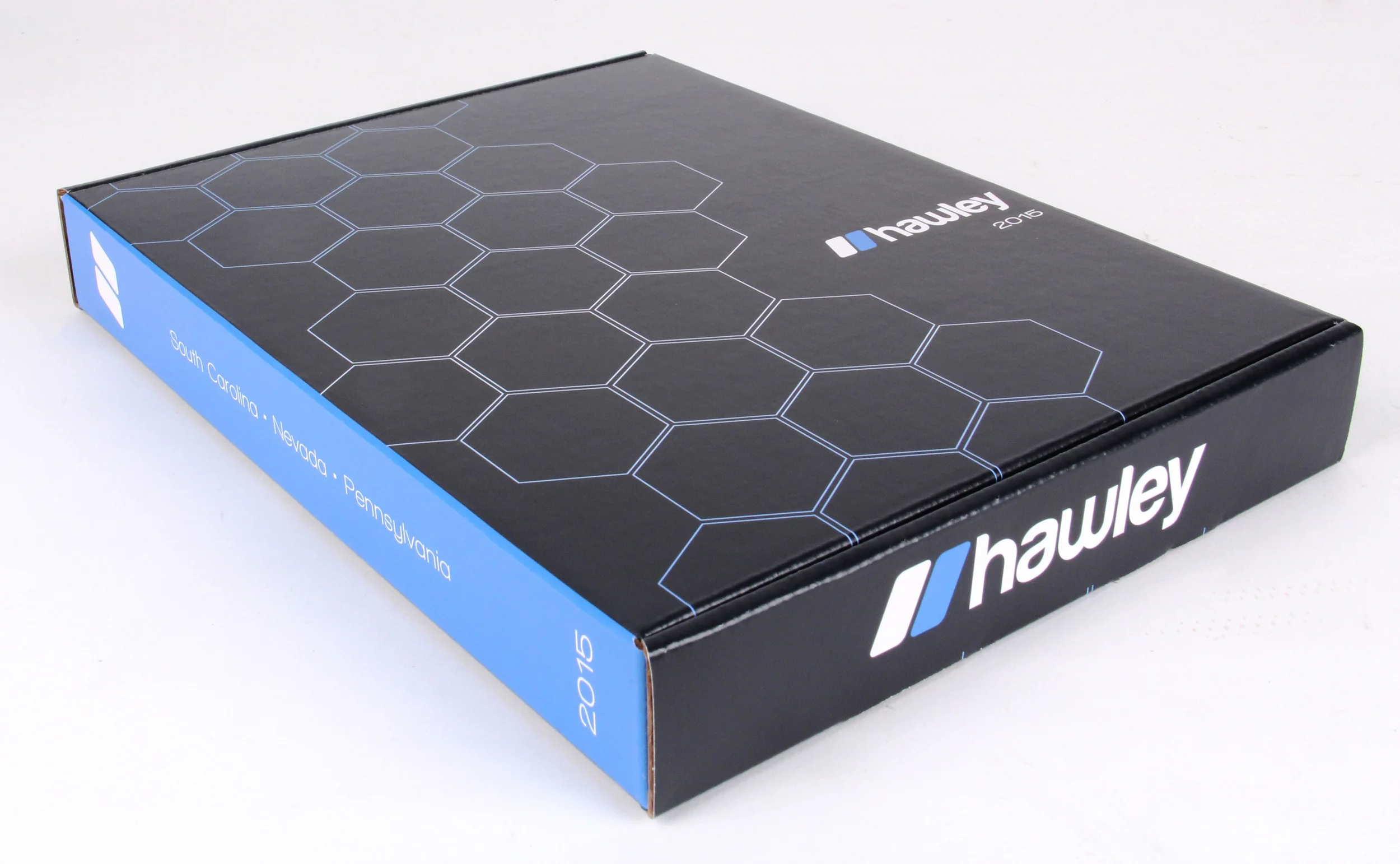
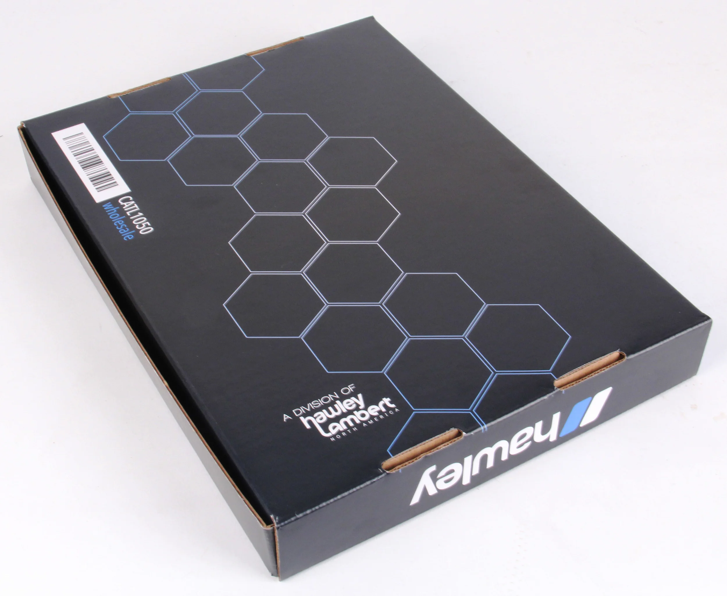
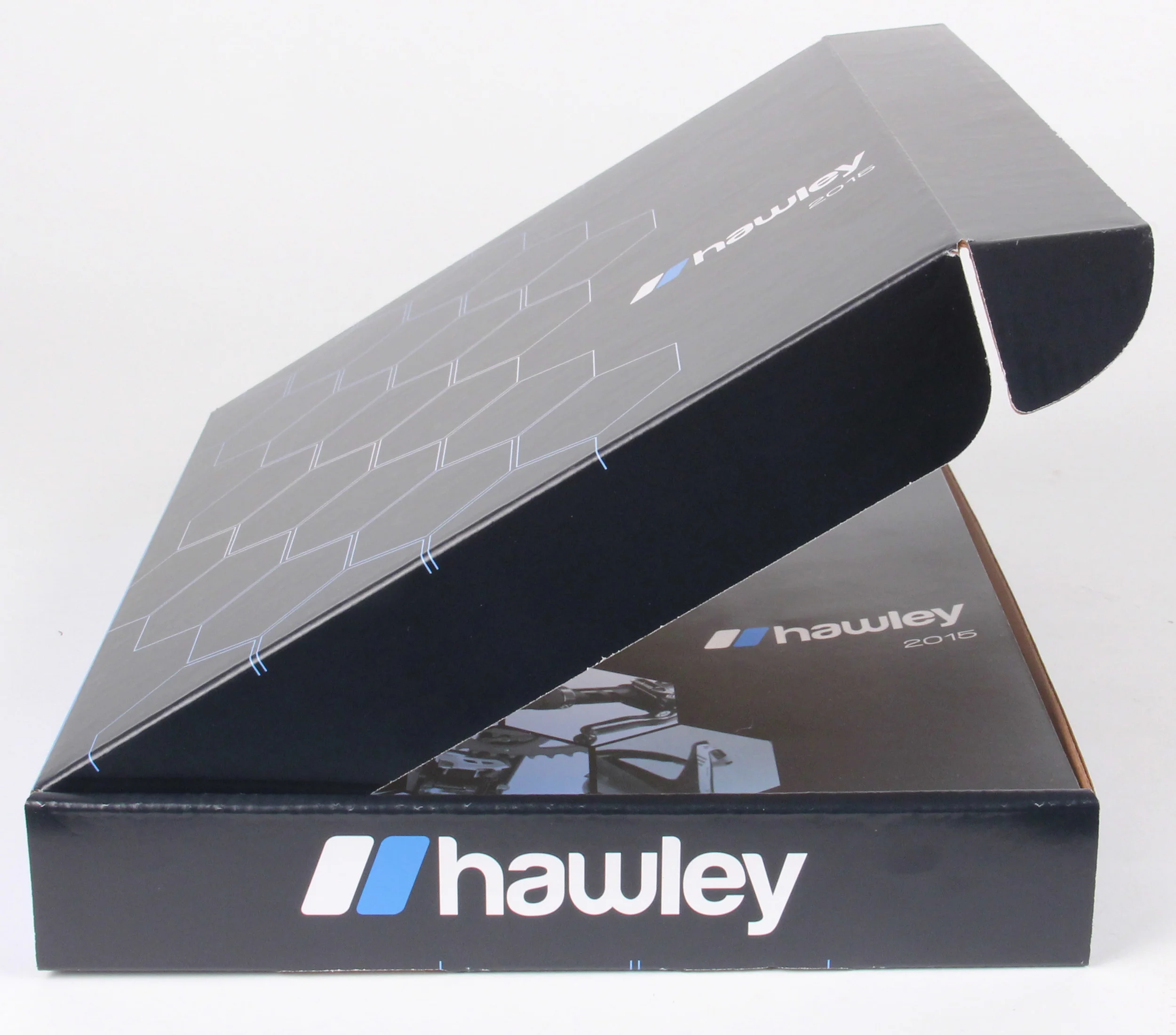
Catalog Shipping Box Design
Thought I’d carry on the concept of the cover design to the box design in that it is simple and abstract and you wonder what could be in the hexagons, just like you have to take a closer look to see what’s in the hexagons on the cover. There is also the effect of opening the box to see whats inside not only the box, but also the hexagons, as you will see what is inside of them when you see the cover of the catalog. There is correlation without exact replication.